
Designing a Button Bar-Style UISegmentedControl in Swift
I’ve been working on a project and I wanted the neat “button bar-style” design for my UISegmentedControl, where there
are no borders around the segments and there’s a small bar below the selected segment which moves when you choose a new
segment. I found a couple of really good third-party projects that handled this, but I had some trouble with them and decided
to try doing it myself. Just a disclaimer, this is one way of doing it; I’m using auto layout constraints, building
the views programatically, and doing all of my theming inline for the purposes of simplicity.
Getting started
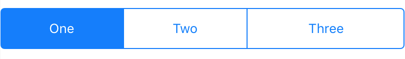
I’m doing this in a Swift playground, so let’s start with the basics by creating a new UIView and adding a UISegmentedControl
to it with three segments. Also to note, the way I’m building out my constraints will assume all segments are of equal length. If
not, the button bar at the bottom of the selected segment might end up being too wide or not wide enough for the segment it’s under.
import UIKit
import PlaygroundSupport
// Container view
let view = UIView(frame: CGRect(x: 0, y: 0, width: 400, height: 100))
view.backgroundColor = .white
let segmentedControl = UISegmentedControl()
// Add segments
segmentedControl.insertSegment(withTitle: "One", at: 0, animated: true)
segmentedControl.insertSegment(withTitle: "Two", at: 1, animated: true)
segmentedControl.insertSegment(withTitle: "Three", at: 2, animated: true)
// First segment is selected by default
segmentedControl.selectedSegmentIndex = 0
// This needs to be false since we are using auto layout constraints
segmentedControl.translatesAutoresizingMaskIntoConstraints = false
// Add the segmented control to the container view
view.addSubview(segmentedControl)
// Constrain the segmented control to the top of the container view
segmentedControl.topAnchor.constraint(equalTo: view.topAnchor).isActive = true
// Constrain the segmented control width to be equal to the container view width
segmentedControl.widthAnchor.constraint(equalTo: view.widthAnchor).isActive = true
// Constraining the height of the segmented control to an arbitrarily chosen value
segmentedControl.heightAnchor.constraint(equalToConstant: 40).isActive = true
PlaygroundPage.current.liveView = view
The playground live view shows us our basic UISegmentedControl. Don’t forget to append the isActive property to each of the auto layout
constraints with a value of true or they won’t work.
Colors, Fonts, and Borders Oh My!
Next, let’s remove the backgroundColor and tintColor. When the tintColor is removed, the borders and the selected segment background color
will also disappear.
// Add lines below selectedSegmentIndex
segmentedControl.backgroundColor = .clear
segmentedControl.tintColor = .clear
If you look at the live view, since we removed the tintColor the UISegmentControl has briefly “disappeared” since everything is now a clear color.
To bring back the labels, let’s change the font and text color of both the selected segment and non-selected segments.
// Add lines below the segmented control's tintColor
segmentedControl.setTitleTextAttributes([
    NSAttributedStringKey.font : UIFont(name: "DINCondensed-Bold", size: 18),
    NSAttributedStringKey.foregroundColor: UIColor.lightGray
    ], for: .normal)
segmentedControl.setTitleTextAttributes([
    NSAttributedStringKey.font : UIFont(name: "DINCondensed-Bold", size: 18),
    NSAttributedStringKey.foregroundColor: UIColor.orange
    ], for: .selected)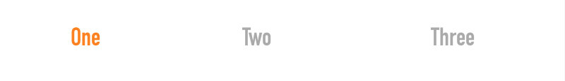
Almost there! Now we have to add a bar below the selected segment.
Adding the Selected Segment Bar
The button bar will be a simple UIView with a backgroundColor matching the color of the selected segment’s font color. This can obviously be different,
but I’m choosing to make both the selected segment font and the button bar orange. Add these lines after the segmented control’s translatesAutoresizingMaskIntoConstraints
property.
let buttonBar = UIView()
// This needs to be false since we are using auto layout constraints
buttonBar.translatesAutoresizingMaskIntoConstraints = false
buttonBar.backgroundColor = UIColor.orange
Next, add the buttonBar as a subview to the container view below the addSubview call for the segmentedControl.
// Below view.addSubview(segmentedControl)
view.addSubview(buttonBar)
Finally, we need to give the button bar a width, height, and position. Add these constraints below the segmentedControl constraints.
// Constrain the top of the button bar to the bottom of the segmented control
buttonBar.topAnchor.constraint(equalTo: segmentedControl.bottomAnchor).isActive = true
buttonBar.heightAnchor.constraint(equalToConstant: 5).isActive = true
// Constrain the button bar to the left side of the segmented control
buttonBar.leftAnchor.constraint(equalTo: segmentedControl.leftAnchor).isActive = true
// Constrain the button bar to the width of the segmented control divided by the number of segments
buttonBar.widthAnchor.constraint(equalTo: segmentedControl.widthAnchor, multiplier: 1 / CGFloat(segmentedControl.numberOfSegments)).isActive = true
As the last comment says, we need the width of the button bar to be the width of the segmentedControl divided by the number of segments. This guarantees
the button bar width will exactly match the width of a single segment, again assuming all segments have equal width.
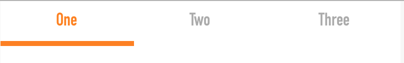
The initial view is now complete! As a final step, we need to have our button bar move to the selected segment whenever it changes.
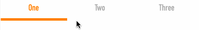
Animating the Button Bar
When the selected segment changes, the segmented control needs to call a function that will handle the transition of the button bar’s position on the x-axis
so it winds up underneath the selected segment. We have to jump through a couple hoops since this is a Swift playground, so below your import declarations,
create a new Responder class and instantiate it to a varible. Add a function definition to the Responder class, then add a callback to the segmentedControl
variable to fire when the segmentedControl’s value changes.
// Below import statements
class Responder: NSObject {
    @objc func segmentedControlValueChanged(_ sender: UISegmentedControl) {
    }
}
let responder = Responder()
...
// Above the PlaygroundPage.current.liveView = view statement at the bottom
segmentedControl.addTarget(responder, action: #selector(responder.segmentedControlValueChanged(_:)), for: UIControlEvents.valueChanged)
Be sure to pass in the sender as an argument to the function of type UISegmentedControl since we need access to it when the function
is called. The last piece of the puzzle is updating the buttonBar’s value on the x-axis inside the function so it will move under the
selected segment.
@objc func segmentedControlValueChanged(_ sender: UISegmentedControl) {
  UIView.animate(withDuration: 0.3) {
      buttonBar.frame.origin.x = (segmentedControl.frame.width / CGFloat(segmentedControl.numberOfSegments)) * CGFloat(segmentedControl.selectedSegmentIndex)
  }
}
To get the correct position on the x-axis, divide the segmentedControl’s frame width by the numberOfSegments, then multiply that by the selectedSegmentIndex.
Voila! We have our animated button bar.
Conclusion
I hope this post has been informative as a DIY solution to something you’ve probably seen in a lot of libraries or on a lot of iOS applications. From here, you can
hook up the UISegmentedControl to a UIPageViewController or UIScrollView as a way of moving between segmented content. You can find the playground code
here as a GitHub Gist, and good luck with your iOS development!